
In this article we see how to do the basis of Machine Learning: Linear Regression ! For this we will use the Keras library.
But first, what is a linear regression?
Linear regression is an approach to solve a problem.
Let’s take an example.
We have gathered data on a whole population:
- the age of each individual
- their health insurance charges
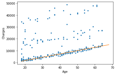
If we display this data on a graph, here is the result:
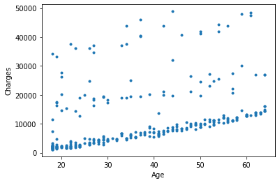
This is called a points cloud.
Here, the goal of linear regression is to find a mathematical relationship between age and insurance charges for that population.
An example of a relationship would be: as an individual’s age increases, so do their health insurance charges.
This relationship must be linear, i.e. it must be explained as an equation y = ax+b.
x being the age of the individual and y being the insurance charges.
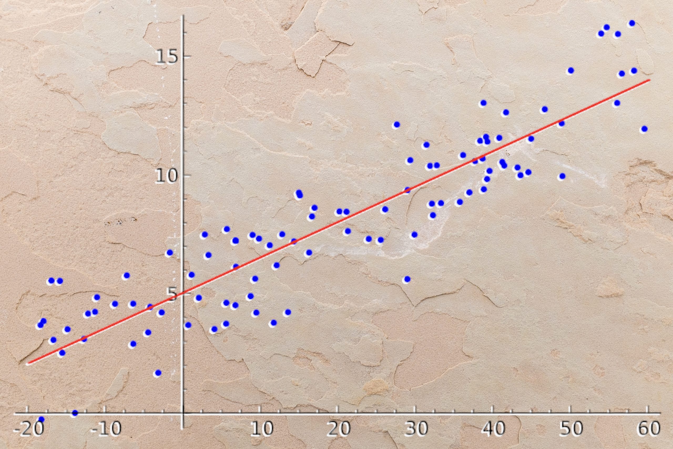
Here is an example of a linear regression (orange line):
The above equation is : y = 280x-4040
If an individual is 20 years old, his expenses are equal to 280*20-4040 = 1560
However, this does not work for all individuals.
You can see on the graph that the orange line (linear regression) does NOT pass through all the points.
The linear regression does not give a perfect solution for the problem. It does not predict all the points.
BUT, it gives an optimal solution.
Optimal because we can predict most of the points with this linear regression.
This makes it a fast solution and adapted to many problems.
Let’s get to Deep Learning with Keras !
Multiple Linear Regression
In a classical linear regression, we take one data (age) to explain another (insurance charges).
But in Deep Learning, the operation is often more challenging.
In our case we’ll have to take multiple data to explain another one.
Let’s start by importing the dataset:
!git clone https://github.com/tkeldenich/datasets.gitWe can read it with the Pandas library:
import pandas as pd

df = pd.read_csv('datasets/insurance.csv')
df.head()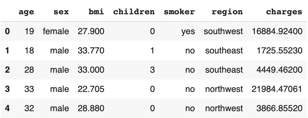
The objective in this problem is to use the age, gender, BMI, number of children, smoking and region of residence (prediction data) of individuals to predict their health insurance charges (prediction data).
This is called Multiple Linear Regression because we take multiple variables to explain another one.
Many of these data are categorical variables.
For example, gender has two options:
- male
- female
Instead of having this data in text form, let’s turn it into numbers:
- 0
- 1
We apply this transformation by putting the result in a new variable X :
X = pd.DataFrame()
df.sex = pd.Categorical(df.sex)

X['sex'] = df.sex.cat.codes
We display the result:
X.head()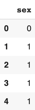
The transformation categorical text => categorical numbers works.
Let’s apply it to the rest of our categorical data:
df.smoker = pd.Categorical(df.smoker)
df.region = pd.Categorical(df.region)

X['smoker'] = df.smoker.cat.codes
X['region'] = df.region.cat.codes
We now have all our categorical data in the variable X.
Let’s transfer the rest of the prediction data into this same variable:
X['age'] = df['age']
X['bmi'] = df['bmi']
We now have all our prediction data in the variable X. Let’s display them:
X.head()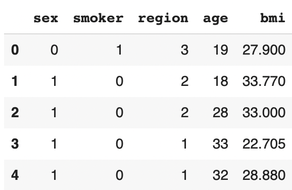
X_train, X_test, Y_train, Y_test
All we need now is the data to predict Y :
Y = df['charges']We have the X and the Y.
We can now separate the training and test data :
from sklearn.model_selection import train_test_split

X_train, X_test, Y_train, Y_test = train_test_split(X, Y, test_size=0.20)
Our data is ready!
We can get down to business with Deep Learning.
IMPORTANT: If you don’t understand what X and Y data and/or training and test data are, I invite you to read this introduction article to Keras.
Linear Regression Model with Keras
To do a Multiple Linear Regression with Keras, we need to import :
from tensorflow.keras.models import Sequential
from tensorflow.keras.layers import Dense
If you are a beginner you can try with two simple Dense layers, like this:
model = Sequential()
model.add(Dense(64, input_dim = 5))
model.add(Dense(1))
We compile :
model.compile(optimizer = 'adam', loss = 'mean_squared_error', metrics = ['mse', 'mae'])For the compilation⬆ the linear regression gives us a last constraint: the loss function must be the Mean Squared Error.
It allows us to calculate the error between our prediction and the actual result.
The error is a kind of distance between our two data.
The more the prediction is far from the real result, the more the model must improve.
Another thing, for the metrics I chose to display here the mse (Mean Squared Error) and the mae (Mean Absolute Error).
With each of this two error, we can see how results evolve.
The idea is that the more the model is optimized, the more the error should decrease.
Training
We can train the model :
By the way, if your goal is to master Deep Learning - I've prepared the Action plan to Master Neural networks. for you.
7 days of free advice from an Artificial Intelligence engineer to learn how to master neural networks from scratch:
- Plan your training
- Structure your projects
- Develop your Artificial Intelligence algorithms
I have based this program on scientific facts, on approaches proven by researchers, but also on my own techniques, which I have devised as I have gained experience in the field of Deep Learning.
To access it, click here :
Now we can get back to what I was talking about earlier.
history = model.fit(X_train, Y_train, validation_split=0.2, epochs=200)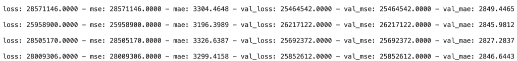
Here we see the MSE and the MAE results.
Both evolve in a similar way. When one increases, the other increases. When one decreases, the other decreases.
So we have the same information on these two metrics.
BUT, I prefer to look at the MAE score. The latter being much closer to our insurance charges values.
Let me explain.
Looking at the MSE on the last line, we see 28,009,306. This score makes no sense to us. None of our variables seem to be related to a score that high. On the other hand it makes sense for the Deep Learning model which uses it to optimize itself!
However, looking at the MAE on the last line, we see 3.299,4. This score makes a lot more sense! It seems to be related to our insurance expense data.
We have to interpret the MAE as follows: if the score is 3.299,4 it means that when we predict the insurance charges of an individual, the average error is 3.299,4.
For example, Mr. Paul, 33 years old, is predicted to have insurance charges of $13,299.4 when the actual value is $10,000.
This score predicted is relatively close to the actual value.
The goal is to minimize this distance.
What to remember: MSE is used by the algorithm to optimize itself, MAE is used by the Data Scientist/Engineer/etc to measure the model performance.
Let’s go further into the analysis of the result!
Understanding the results with KPIs
Let’s start by displaying the evolution of the MAE during the training:
import matplotlib.pyplot as plt

#plot the loss and validation loss of the dataset
plt.plot(history.history['mae'], label='mae')
plt.plot(history.history['val_mae'], label='val_mae')

plt.legend()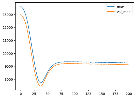
The evolution is good, there is no unusual event, the decrease is regular and the validation values follows the training values.
Once again, if you don’t understand the analysis of this curve, I invite you to see this article on the basics of Deep Learning with Keras.
Now we want to analyze our model on data that it has never seen before: the test data…
scores = model.evaluate(X_test, Y_test, verbose = 0)

print('Mean Squared Error : ', scores[1])
print('Mean Absolute Error : ', scores[2])
Mean Squared Error : 41.614.964,0
Mean Absolute Error : 4.095,5
Here once again, I am only interested in the MAE.
The result seems good ! There is only a slight difference between the result on the training data (3.299,4) and the test data (4.095,5).
R2 score
We’ll use a last measure to really get an idea of the result of the model.
First we retrieve all the predictions on the test data:
Y_pred = model.predict(X_test)Then we compare them to the real data.
For this we use the R2 score.
The R2 Score gives us an accuracy rate.
The advantage compared to the MAE is that it gives us a much clearer objective.
With the MAE the objective is to get closer to 0. But in our case an error of 100, 500, 1,000, even 3,000$ is acceptable.
For example, if we predict Mrs. Lapie’s insurance charges to be $46,000 when they are actually $45,000, the error is minimal.
This is because: the higher the insurance charges, the less impact the error has.
If, on the other hand, the objective is to predict the price of a $3 pen and the error is $1,000… there is a big problem.
In fact, the MAE must be considered according to the value scale of Y.
The MAE must tend to zero. But if the goal is high, the MAE can be considered good even when it is high.
With the MAE, one must have in mind the scale of values of Y.
But with the R2 score, there is no need of it!
The R2 score, gives results that naturally conform to the Y value scale.
It gives us a precision rate.
We calculated it with the SKLearn library:
from sklearn.metrics import r2_score

print('r2 score: ', r2_score(Y_test, Y_pred))
Output : 0.73
Our precision is 73%, it’s an acceptable precision but it can be improved !
Here, we can decide that : getting a result close to 85% / 90% is a good score.
Understanding the results visually
Let’s finish with the interpretation of the results without metrics, only visually.
First we can see the results 1 by 1:
Y_pred[:5]4536.7
3526.3
2121.1
3986.7
14031.6
And compare them to the real values:
Y_test.head()23288.9
1909.5
1719.4
2166.7
11365.9
I let you analyze by yourself these results, you can put your answer in comments.
Then, the most interesting part because the most visual!
Let’s display each of the predicted values according to the real values:
Y_pred = model.predict(X_test).flatten()

a = plt.axes(aspect='equal')
plt.scatter(Y_test, Y_pred)
plt.xlabel('True values')
plt.ylabel('Predicted values')
plt.xlim([0, 50000])
plt.ylim([0, 50000])
plt.plot([0, 50000], [0, 50000])
plt.plot()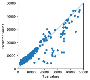
Here we have a central line.
The closer the points are to the line, the better the prediction.
Why?
Because a point is on the line when the predicted value is equal to the actual value.
For example, if the predicted value is 10.000 and the actual value is also 10.000, the point will be exactly on the line.
The more the points are close to the line, the more accurate the model is.
Here we see only few points being very far from the line. This means that the model has a good accuracy.
Conclusion
Remember that to perform a (Multiple) Linear Regression:
- Transform your textual categorical data into numbers
- Do not set an activation function in the last layer of your model
- Use the Mean Squared Error (mse) in loss
- Use the Mean Absolute Error (mae) in metrics
- R2 score will allow you to have a clear optimization objective
- Displaying the predicted data as a function of the actual data allows you to visually analyze your results
Now you just have to optimize your model!
We explain the right techniques in the following articles:
See you soon on Inside Machine Learning! 🔥
One last word, if you want to go further and learn about Deep Learning - I've prepared for you the Action plan to Master Neural networks. for you.
7 days of free advice from an Artificial Intelligence engineer to learn how to master neural networks from scratch:
- Plan your training
- Structure your projects
- Develop your Artificial Intelligence algorithms
I have based this program on scientific facts, on approaches proven by researchers, but also on my own techniques, which I have devised as I have gained experience in the field of Deep Learning.
To access it, click here :


I’m pretty sure your “Points Cloud” is just a scatter plot, since it’s 2D, and not 3D.