
Tired of matplotlib and those 2000 style graphics ? Let us introduce you THE library to know for 3D analysis.
This library is Plotly. A package that will allow you to realize high quality graphics.
Indeed, with Plotly you can quickly create 3D graphics with very few lines of code.
Scroll down to know better⬇
Vous en avez marre de matplotlib et de ces graphismes style 2000 ? On vous présente LA librairie à connaître pour l’analyse 3D .
Plotly graph_objects
With Plotly you can easily create 3D graphs.
We start with a very simple and easy to implement graph with plotly.graph_objects :
import plotly.graph_objects as go
import numpy as np

t = np.linspace(0, 20, 100)
x, y, z = np.cos(t), np.sin(t), t

fig = go.Figure(data=[go.Scatter3d(x=x, y=y, z=z, mode='markers',
                                   marker=dict(
                                       size=10, color=z, colorscale='plotly3',
                                       opacity=0.8, reversescale=True))])
fig.update_layout(margin=dict(l=0, r=0, b=0, t=0))
fig.show()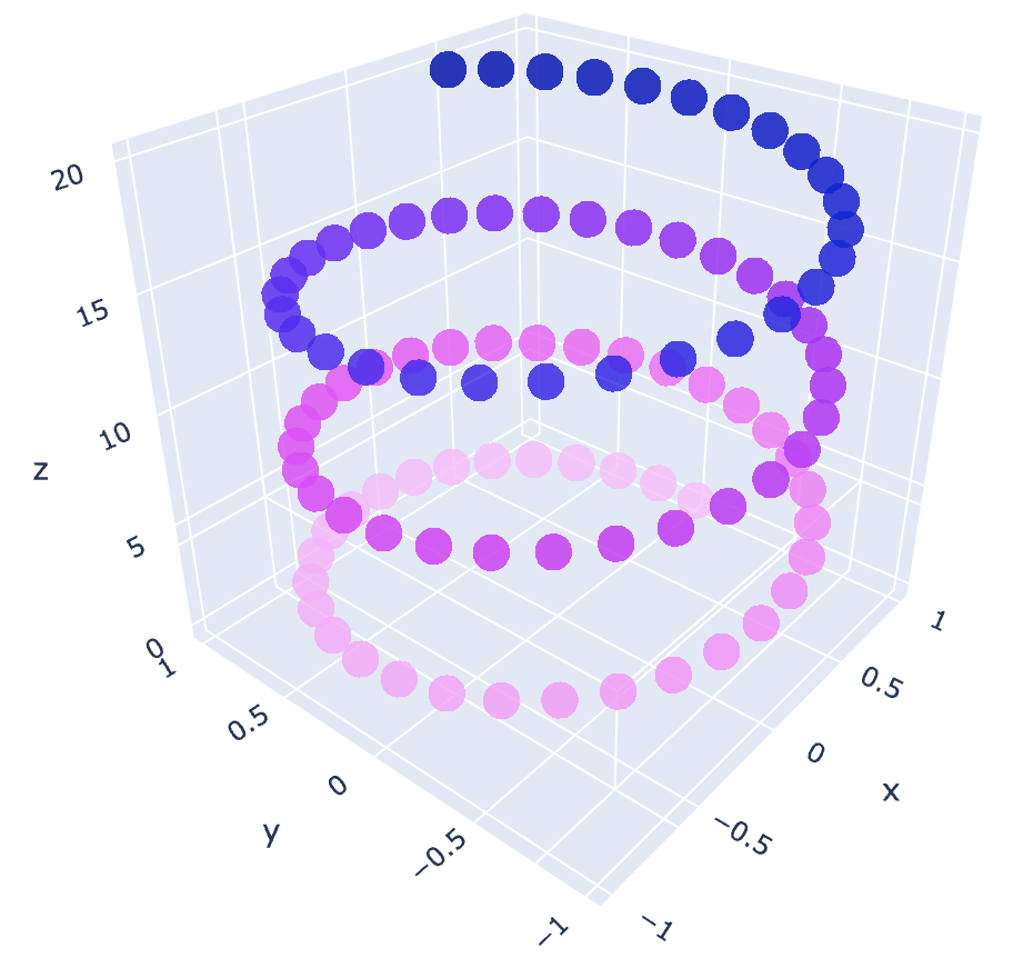
plotly.graph_objects enables us to efficiently visualize clouds of points.
You can see that here, in addition to having a 3D graph, we can set the color to evolve along an axis.
Indeed with color=z in the marker dictionary, we tell Plotly that the higher the value of our points on the z axis, the darker the color should be.
A simple and effective result that allows a better interpretation of the data !
Plotly express
Let’s continue with plotly.express which is a more advanced module.
The specificity of plotly.express is that, in addition to making 3D graphics, it adapts to our dataset.
Here we take the iris dataset which lists the species of plants according to the size of their petal :
By the way, if your goal is to master Deep Learning - I've prepared the Action plan to Master Neural networks. for you.
7 days of free advice from an Artificial Intelligence engineer to learn how to master neural networks from scratch:
- Plan your training
- Structure your projects
- Develop your Artificial Intelligence algorithms
I have based this program on scientific facts, on approaches proven by researchers, but also on my own techniques, which I have devised as I have gained experience in the field of Deep Learning.
To access it, click here :
Now we can get back to what I was talking about earlier.
import plotly.express as px
df = px.data.iris()
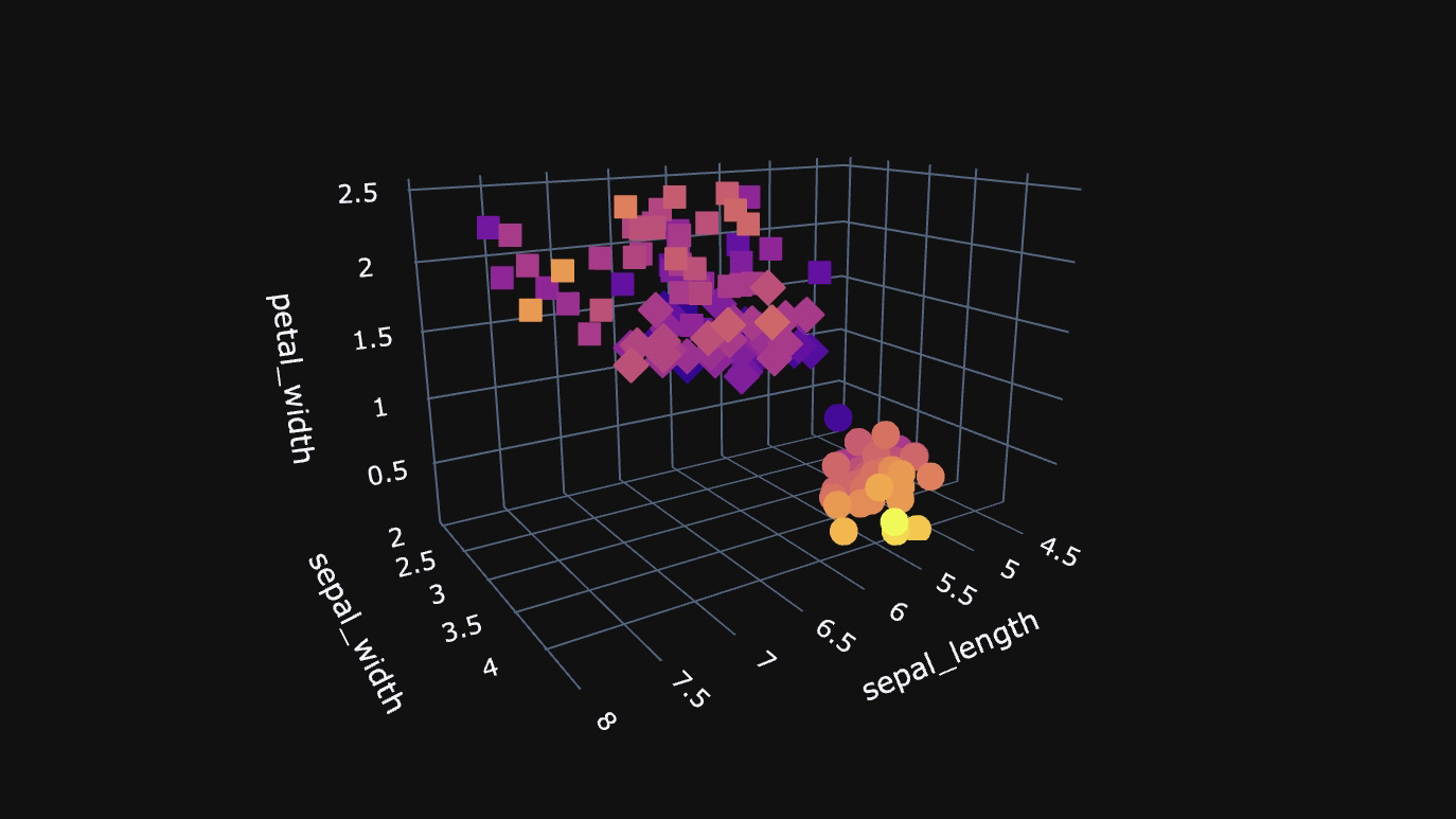
fig = px.scatter_3d(df, x='sepal_length', y='sepal_width', z='petal_width',
color='petal_length', symbol='species')
fig.show()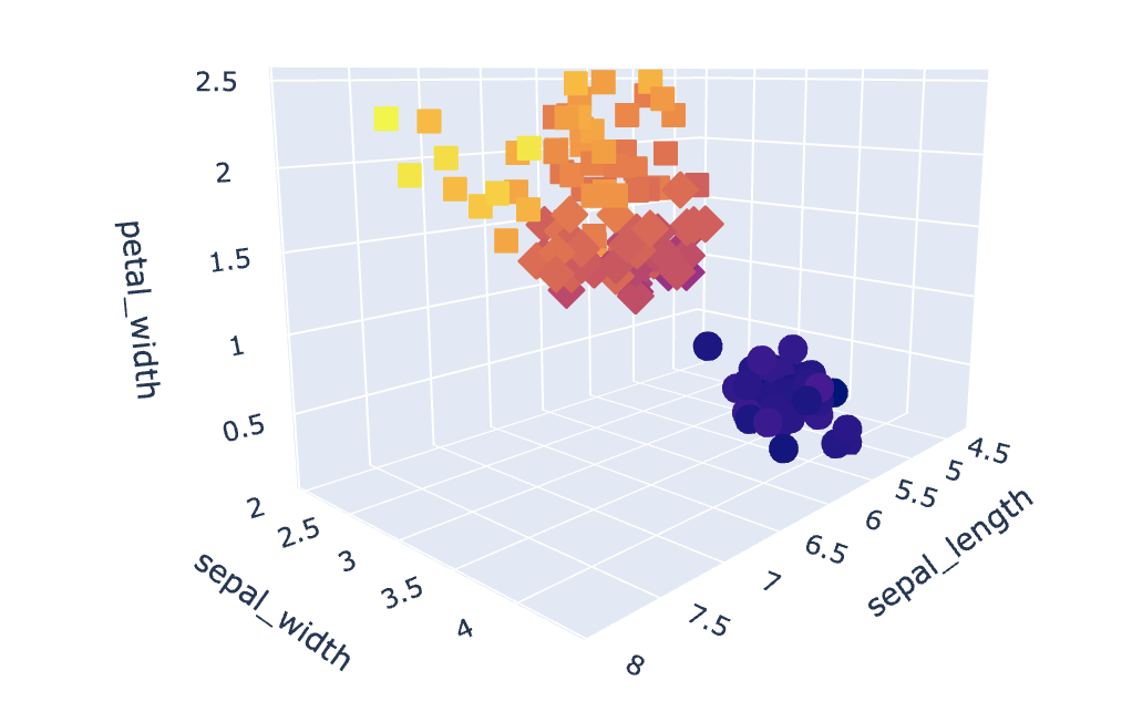
In addition to displaying the dataset distribution, plotly.express can vary the color of the points according to the characteristics of the plants. Here the length of the petals (petal_length).
That is to say that the larger the petal will be, the darker the color will be and vice versa.
We can also see that the shape of the cloud points changes according to the variety of the flower. Thus we will have rounds for the flowers setosa, squares for versicolor and diamonds for virginica.
In a way, these characteristics add a dimension to the graph and allow a better analysis of the data.
And for those who, like me, prefer a more modern style, we can very well add a dark theme to our graph.
For that, we just have to add template=”plotly_dark” in the code.
The result, below :
import plotly.express as px
df = px.data.iris()
fig = px.scatter_3d(df, x='sepal_length', y='sepal_width', z='petal_width',
              color='petal_width', symbol='species')
fig.update_layout(template="plotly_dark")
fig.show()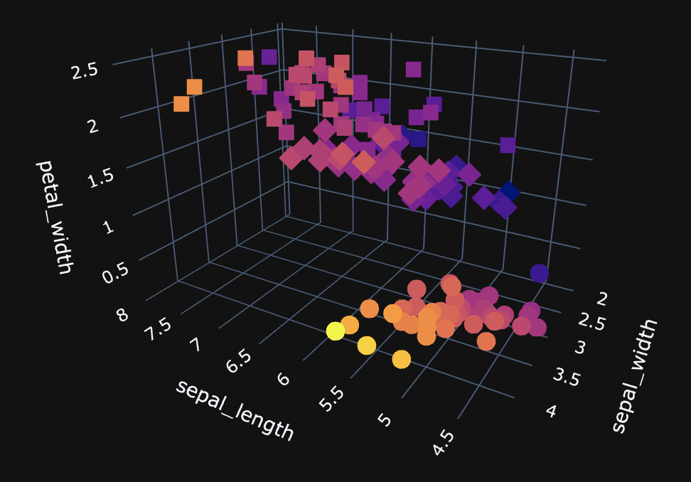
Plotly Multiple 3D Graph
Here, we go further into customization to display both cloud points and surface.
In fact, this surface will represent a logistic regression, a Data Science concept that consists in establishing a separation between data to better classify them.
You can therefore display both cloud points (the basic data) and logistic regression (the result of the data analysis) with 3D graph :
import plotly.graph_objects as go
import numpy as np
from sklearn.datasets import make_blobs

#Initialization of Data
X, y = make_blobs(n_samples = 100, n_features=2, centers=2, random_state=0)
W = np.array([[ 0.50621636], [-1.43113825]])

X0 = np.linspace(X[:, 0].min(), X[:, 0].max(), 100)
X1 = np.linspace(X[:, 1].min(), X[:, 1].max(), 100)

xx0, xx1 = np.meshgrid(X0,X1)
Z = W[0] * xx0 + W[1] * xx1
A = 1 / (1 + np.exp(-Z))

#Using Plotly
fig = (go.Figure(data=[go.Surface(z=A, x=xx0, y=xx1, colorscale='haline', opacity = 0.7)]))

fig.add_scatter3d(x=X[:, 0].flatten(), y=X[:, 1].flatten(), z=y.flatten(), mode='markers',
                  marker=dict(size=5, color=y.flatten(), colorscale='haline',opacity=0.9))

fig.update_layout(margin=dict(l=0, r=0, b=0, t=0))
fig.layout.scene.camera.projection.type = "orthographic"
fig.show()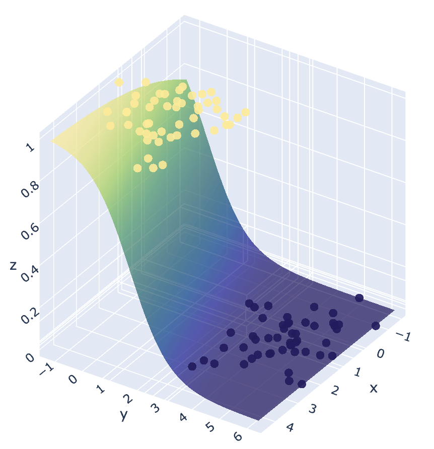
This completes this article on Plotly, an article that I hope will have met your expectations !
sources :
- Machine Learnia – GitHub
One last word, if you want to go further and learn about Deep Learning - I've prepared for you the Action plan to Master Neural networks. for you.
7 days of free advice from an Artificial Intelligence engineer to learn how to master neural networks from scratch:
- Plan your training
- Structure your projects
- Develop your Artificial Intelligence algorithms
I have based this program on scientific facts, on approaches proven by researchers, but also on my own techniques, which I have devised as I have gained experience in the field of Deep Learning.
To access it, click here :